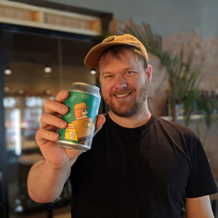
As the inaugural GABS Can Design Awards shine a long overdue high profile spotlight on the importance and skill of beer can design, Beer & Brewer spoke with the maker of some of Australia’s most instantly identifiable beer can art – designer Clint Weaver.
Known for designing craft beer magazine Froth and running his own design studio Pocketbeagles, Clint is even more widely recognised for his can designs for the Melbourne-based brewing company CoConspirators.
His series of character-focussed artworks for them have turned many a bottle store fridge into a pseudo gallery since 2017 with their cartoonish, often subtly menacing, pop-culture charms. The front of the cans don’t even need to mention the brewing company’s name as Clint’s consistent artwork weaves the story for them. As the brewery have said: “He brings our beer to life”.
The CoConspirators entry in the GABS Can Design Awards is their Postman IPA. Clint’s mid-pandemic design is “loosely inspired by the amount of beer being delivered to people’s homes during COVID”. It on one hand celebrates some of the nation’s busiest workers while on the other deftly continues his CoConspirators theme of playfulness and mischievousness done simply.
Voting for the GABS award close tomorrow. Head here to have your say.
Clint was kind enough to let us into his design world and to shed some light on his work for CoConspirators, but to also remark on the wider aspects of design and brand development in the beer and brewing industry.
Sit back, grab a can and read on .
Some of Clint’s work for the CoConspirators Brewing Co
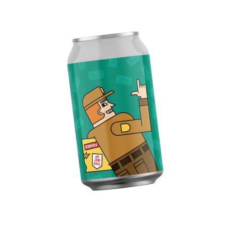
The Postman 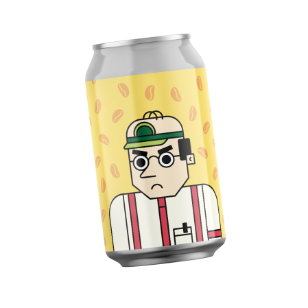
The Beancounter 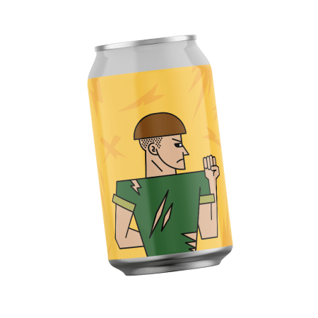
The Fallguy 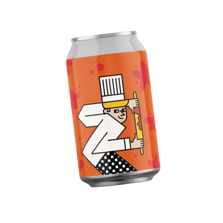
The Pastry Chef
Q. The GABS Award must come as a nice distraction for can art designers at this time?
Absolutely and I think it’s probably long overdue. Being able to submit to it for free is great and it’s opened the doors for a lot more breweries who otherwise wouldn’t have submitted their designs. I was pleasantly surprised when I had a look through too. There was way more than I thought there would be and the quality was really, really good as well. I can be quite critical of the Australian beer design scene and the general quality overall. I’ve only been doing this for three or four years but (this award shows) there has been a definite improvement over that period. It was nice to look at the 100-plus submissions and see some absolute corkers in there.
How important is it to have this type of recognition for what’s going on outside the tin?
It’s nice to see this thing happening. As a designer, and also a marketer, I’ve been trying to spruik the importance of graphic design and branding in the beer industry for the past few years. I think the biggest part for me, with these awards, is it’s recognising the importance that design has on success for breweries. CoConspirators is a perfect example. They sort of just shot out of the gate straight away on the back of some interesting new designs and backed it up with some really quality product as well. I think my mission really is to make sure everyone knows that you need to hire a designer and pay for design to help achieve success.
Where did the design inspiration come from for The Postman?
I like to inject a bit of humor in my work, and so the idea of a busy, mid-COVID postman, with a package that is all banged up, was sort of the starting point. Then I thought of the start of Ace Ventura Pet Detective, when Jim Carrey’s character is dressed up as a delivery guy and kicking a package down the hallway, and that helped develop the framework of it. It continues the overall theme of my work for CoConspirators. From the outset, when they had just started their brand, the idea that led to my work for them, is in the name CoConspirators. They knew they wanted to portray each product as a different character and we’ve now built this whole world as more releases have come out. Each new release strengthens the whole brand.
What was the thought process behind not presenting the brand name alongside the artwork?
I’m a massive fan of Mikkeller (Danish craft brewery) and the way they portray their character within their design and their brand. You don’t need to see a name, you just see the character, and you know it’s Mikkeller beer. The way I wanted to build that idea into the brand was a sort of forced interaction with the characters from the beginning. So you can look in the fridge and see this thing and you don’t know what it is or who it is until you physically grab it and pick it up.
With so much noise out there in terms of market saturation, how can a designer help a brewery to cut through that and make them stand out?
It’s getting a lot harder now. Three or four years ago it was probably a bit easier because there wasn’t as much on the shelf that was attractive. Now, you can have a beautiful can but it’s not going to stand out among a whole range of other beautiful cans. You’ve got to have something else there to set it apart. You need to find that hook or that story and make sure it’s something different than what has been seen before. I think the angle now is in social media rather than fridge space for something to stand out. And if I was starting a brewery, a good portion of the marketing spend would be going to social media advertising alongside the designs to hype the beer up before a customer even walks into the bottle shop. Going blind into a bottle shop can be overwhelming for the consumer.
Your work for CoConspirators has had a consistent brand message since day one, what value do you place on consistency in beer can art?
It’s probably the most important thing I would say, and that’s what I get most frustrated at. When I see fantastic brewers with fantastic product and the designs can be wonderful but if they don’t look and feel the same, you’re not adding to the brand. With every CoConspirators release, the artwork strengthens the brand every time. If you just release another thing that looks nothing like your other things then that sort of muddles it. Consistency and simplicity are definitely the two words that I live by with my designs.
Where does good beer can design begin?
One half of it is understanding the client and the message that they want to send out there. And the other side of it is looking at who will be buying it and working out what is going to sell them on it. You will have times where a client has very strong artistic ideas that they want to put forward but then their customer base just doesn’t align with that message. Fortunately, now that I have a good body of work behind me, I can afford to be honest with people rather than just trying to get their work. (Breweries) need to trust the professionals to do their job. They perhaps should see it like they are the professionals making their product as good as it can possibly be and if they’ve gone to the effort of hiring someone to do design, which they should be, they should entrust them and know they’re going to do their job perfectly as well.
What’s the feeling like seeing your work out in the public and in people’s hands?
I love craft beer, and it was my goal from the outset, as I studied design, even before actually, to get my art on a can. The feeling is amazing actually. I send the cans over to my Dad in WA and he’s always so stoked to see them. In terms of it being an art piece, you can get it out there in people’s hands, and that’s big for a designer, but what I really want to achieve is to make art on a can that people would want to put on their wall. I want it to have that level of quality to it.
Head to Clint’s Pocketbeagles website here or track him down on Instagram here
Contact Beer & Brewer by clicking here to share your news and views.