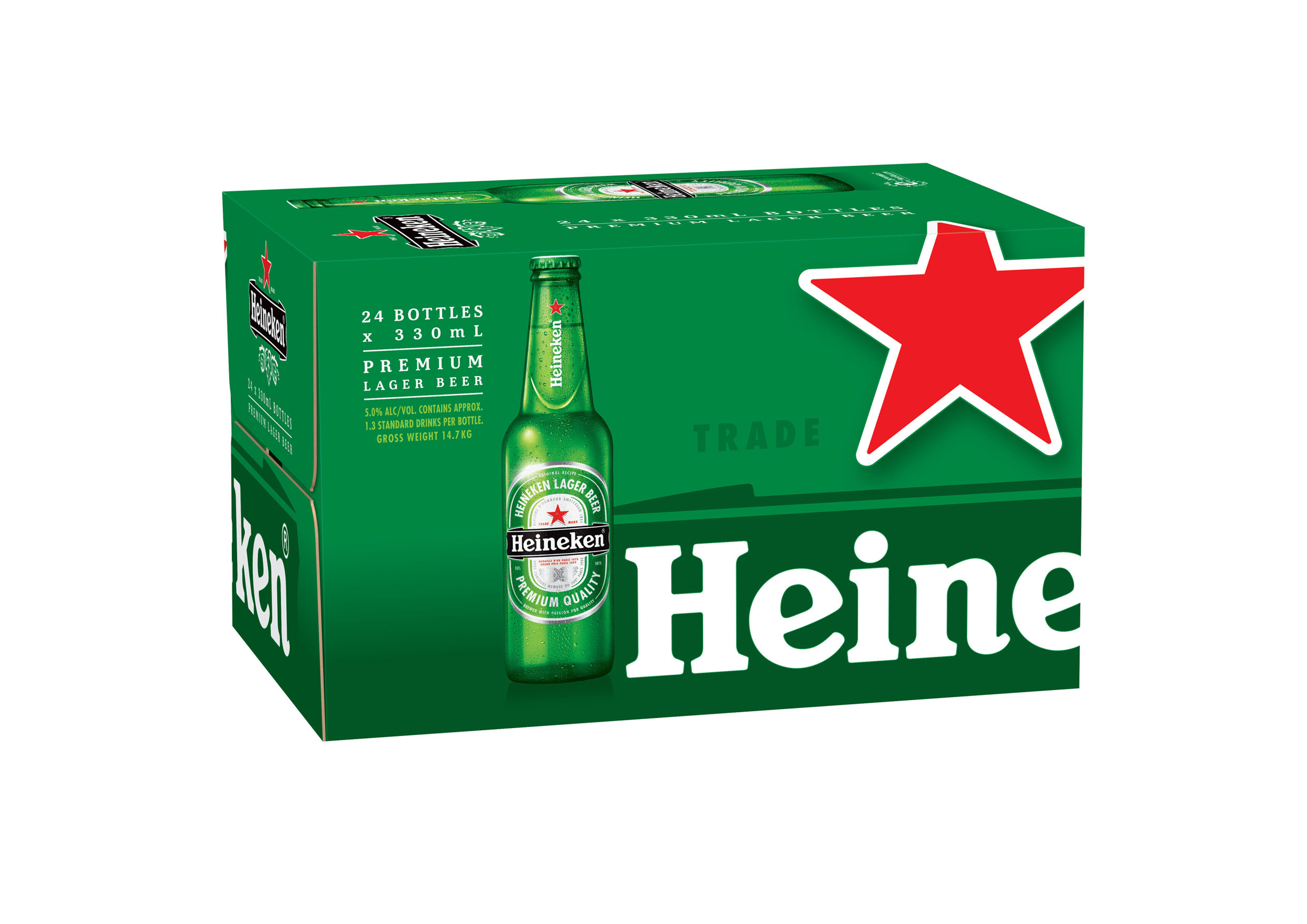
Heineken has launched the latest update to their packaging, unveiling new designs for their six packs and 24 packs.
Heineken is reportedly the sixth most popular beer brand in Australia, and has launched the new packaging in an effort to remain “a progressive and premium leading international brand”.
The new packaging design emphasises the famous Heineken red star – traditionally a medieval brewers’ symbol – by placing it front and centre on the cardboard packaging.
With new designs being rolled out throughout the latter half of June, across the entire country, Heineken Lion Australia believe that the vibrant new design will make it easier for drinkers to spot and purchase in bottle shops.
“Our packaging design has evolved to provide a premium eye – catching product to ensure Heineken stands – out amongst a competitive market,” says Nada Steel, Marketing Manager. “The average shopper is spending 30 seconds in the cool–‐room2. With Heineken’s new packaging design instantly standing out, we hope to deliver superior basket size and increased margin for our retailers.”
